We can add a new element to the contact form by selecting an element from the Form Elements > Add element section.
The different types are listed below.
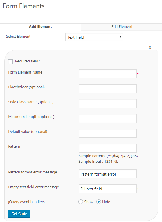
1. Text field
We have also introduced the javascript handlers with the plugin version 1.3. Using this option we can run javascript code.
Form Element Name – This is the name of the form element. Admin can add any name here like yourname, subject, message etc. as the form element name.
Note : DO NOT add “name”,”day”,”month” and “year” as the form element name. WordPress don’t allow these names as element name.
Placeholder – This is the message we can add to the text field.
Style Class Name (optional) – This is the css style class name for this text field element. If you want any special style for this field, you can add the style class here.
Maximum Length – This is the maximum length for the text. If we have entered the value 10, we can enter a text of 10 characters.
Default Value – This is the default value of the text field. This value will be displayed in the contact form by default. (Please note, the default value and placeholder are not same)
Pattern – You can add pattern for checking of the entered value. For example if you want a serial number like 12345ABCDE, you can use a pattern /^\d{5} ?[A-Z]{5}$/ . If anyone entered a value other than the pattern, it will display the error message.
Pattern format error message – This is the error message displayed if the entered value is different from the pattern.
Empty text field error message – This is the error message displayed when we have not entered any value in the field (in the mandatory condition).
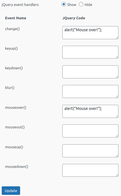
JQuery event handlers – It will support for running custom javascript on change, keyup, keydown, blur, mouseover, mouseout, mouseup, mousedown events of form elements. (introduced in version 1.3)
Once you have entered all the required values, click on the get code button.
It will now generate a short code like [text-1]
Now copy this code and paste it in the contact form section in the left side.
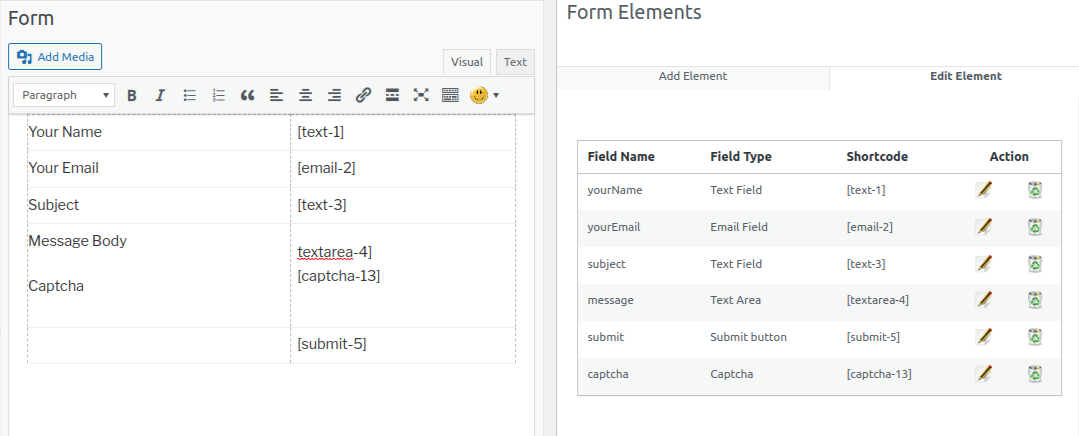
This is the contact form in the visual editor. Click the “html” tag to get the html version of the contact form.
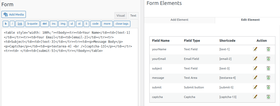
Using the short code we will get only the fields. We need to add the title name of the field manually.
2. Email Field
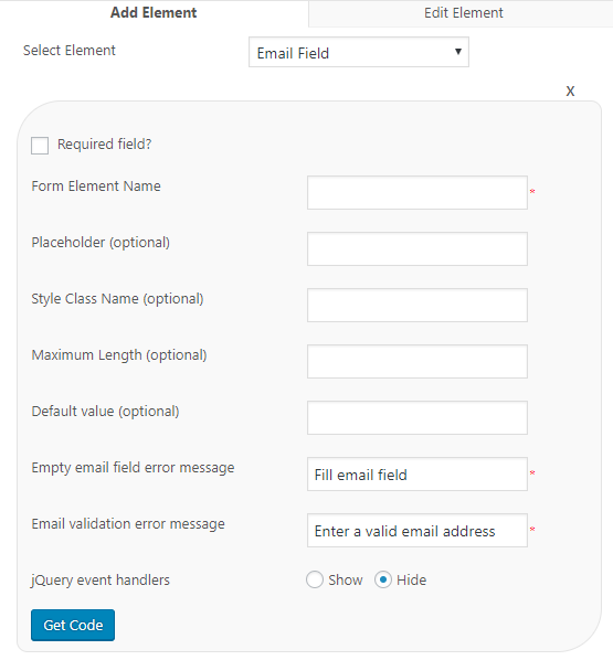
Form Element Name – This is the name of the form element. Admin can add any name here like email, emailaddress etc. as the form element name.
Placeholder – This is the message we can add to the email field.
Style Class Name (optional) – This is the css style class name of email field element. If you want any special style for this field, you can add the style class name here.
Maximum Length (optional) – This is the maximum length for the email. If we have entered the value 10, we can enter email of 10 characters (total) only.
Default Value – This is the default value of the email field. This value will be displayed in the contact form by default. (Please note, the default value and placeholder are not same)
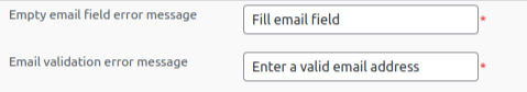
Empty email field error message – This is the error message displayed when the user has not entered any value in the field (in the mandatory condition).
Email validation error message – This is the error message received if the entered email address format is not valid.
JQuery event handlers – It will support for running custom javascript on change, keyup, keydown, blur, mouseover, mouseout, mouseup, mousedown events of form elements.
3. Text Area
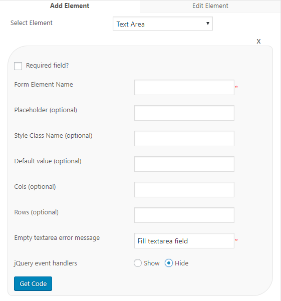
Form Element Name – This is the name of the form element. Admin can add any name here like message, emailbody etc. as the form element name.
Placeholder – This is the message we can add to the text area field.
Style Class Name (optional) – This is the css style class name of the text area field element. If you want any special style for this field, you can add the style class here.
Default Value – This is the default value of the text area field. This value will be displayed in the contact form by default. (Please note, the default value and placeholder are not same)
Cols (optional) – This is the number of columns present in the text area.
Rows (optional) – This is the number if rows present in the text area.
Empty textarea field error message – This is the error message displayed when we have not entered any value in the field (in the mandatory condition).
JQuery event handlers – It will support for running custom javascript on change, keyup, keydown, blur, mouseover, mouseout, mouseup, mousedown events of form elements.
4. Drop down Menu
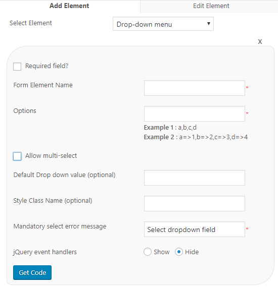
Form Element Name – This is the name of the element.
Options – We can add the values of drop down menu here. There are 2 options for entering the drop down values.
1. We can add the values using comma separated values like a,b,c,d. These values will display in the public side.
2. We can use a “key => value” format with comma separation. Example a=>1, b=>2. Here a and b are keys and 1 and 2 are values. In this format we are displaying the values (1,2) in the public side and the key (a,b) for the internal use.
If you want a contact form with different departments, you can use the departments as values and their respective email addresses as keys. When a user select a department, the contact mail can be send to that department email address with the help of this format.
Allow multi select – If you want to allow your users to select multiple values in the dropdown menu, tick this option.
Default drop down value (optional) – This is the drop down value selected by default.
Style Class Name (optional) – This is the optional style class to the drop down field.
Mandatory Select Error message – This is the error message if the user not selected any value in the mandatory situation.
JQuery event handlers – It will support for running custom javascript on change, keyup, keydown, blur, mouseover, mouseout, mouseup, mousedown events of form elements.
5. Date
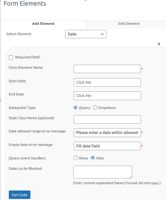
Form Element Name – This is the name of the date element. (eg: date, birthday etc.)
Start Date & End Date – These 2 fields are used as allowed time frame. An user can select a date in this range of date. (introduced in version 1.3)
Date picker type – We have 2 options, jQuery and drop down. In the jQuery, we are displaying a jquery calender and the user can click on the date. In the dropdown type, user can select the day, month and year from the drop down menu. (introduced in version 1.3)
Style Class Name (optional) – If you have any style class for the date field, you can enter the style class name here.
Date allowed range error message – This is the error message displaying if the entered date is not in the given date range. (introduced in version 1.3)
Empty date error message : This is the error message the user received when not entering the date (if the date field is mandatory).
JQuery event handlers – It will support for running custom javascript on change, keyup, keydown, blur, mouseover, mouseout, mouseup, mousedown events of form elements.
6. Check boxes
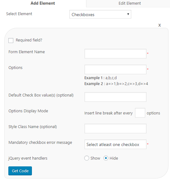
Form Element Name – This is the name of the check box element.
Options – We can add the values of check boxes menu here. There are 2 options for entering the check box values.
1. We can add the values using comma separated values like a,b,c,d.
2. We can use a “key => value” format with comma separation. Example a=>1, b=>2. Here “a and b” are “keys” and “1 and 2” are “values”. In this format we are displaying the values in the public side and the key for the internal use.
If you want a contact form with different departments, you can use the departments as values and their respective email addresses as keys. When a user select a department, the contact mail can be send to that department email address with the help of this format.
Default check box value (optional) – This is the check box value selected by default.
Options Display Mode – We can display all the check boxes in a single row or one by one in new lines. If you want to display each value in a new line, insert line break after every “1” options.
Style Class Name (optional) – This is the optional style class to the check box field.
Mandatory check box error message – This is the error message if the user not selected any value (in the mandatory condition).
JQuery event handlers – It will support for running custom javascript on change, keyup, keydown, blur, mouseover, mouseout, mouseup, mousedown events of form elements.
7. Radio Button
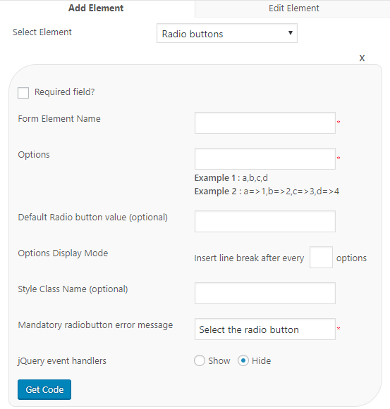
Form Element Name – This is the name of the radio button element.
Options – We can add the values of radio button menu here. There are 2 options for entering the radio button values.
1. We can add the values using comma separated values like a,b,c,d.
2. We can use a “key => value” format with comma separation. Example a=>1, b=>2. Here “a and b” are “keys” and “1 and 2” are “values”. In this format we are displaying the values in the public side and the key for the internal use.
If you want a contact form with different departments, you can use the departments as values and their respective email addresses as keys. When a user select a department, the contact mail can be send to that department email address with the help of this format.
Default radio button value (optional) – This is the radio button value selected by default.
Options Display Mode – We can display all the radio buttons in a single row or one by one in new lines. If you want to display each value in a new line, insert line break after every “1” options.
Style Class Name (optional) – This is the optional style class to the radio button field.
Mandatory radio button error message – This is the error message if the user not selected any value (in the mandatory condition).
JQuery event handlers – It will support for running custom javascript on change, keyup, keydown, blur, mouseover, mouseout, mouseup, mousedown events of form elements.
8. File Upload
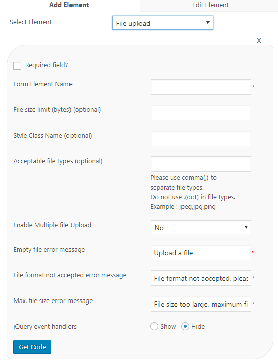
Form Element Name – This is the name of the file upload element.
File size limit (bytes) (optional) – This is the size of the file that can be uploaded. You need to enter the size in bytes. If this field is leave empty, there is no file size restriction and the user can upload files of any size.
Style Class Name (optional) – This is the optional style class name of the file upload field.
Acceptable file types (optional) – This is the acceptable file type. If you want to accept only pdf files, you can enter that value here. If there are one or more file types, use comma(,) to separate file types. Do not use .(dot) in file types. Example : jpeg,jpg,png
Enable Multiple file upload – If you want to allow users to upload multiple files, use this option. (introduced in version 1.3)
Empty file error message – This is the error message if no file is uploaded (in the mandatory condition).
File format not accepted error message – This is the error message when anyone uploaded a file of unlisted file format.
Max. file size error message – This is the error message if anyone uploaded a file of size beyond the allowed size.
JQuery event handlers – It will support for running custom javascript on change, keyup, keydown, blur, mouseover, mouseout, mouseup, mousedown events of form elements.
9. Submit Button
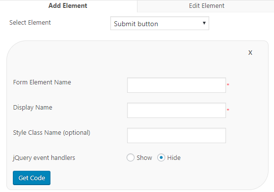
Form Element Name – This is the name of the element
Display Name – This is the name displayed on the submit button.
Style Class Name (optional) – This is the optional style class name of the submit element.
JQuery event handlers – It will support for running custom javascript on change, keyup, keydown, blur, mouseover, mouseout, mouseup, mousedown events of form elements.
10. Captcha
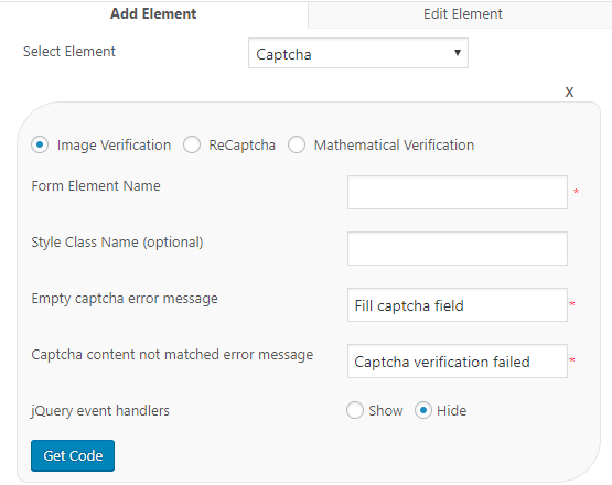
We are providing 3 types of captcha.
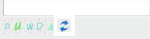
1. Image Verification – The user need to fill the field with the values in the image. It is given below.
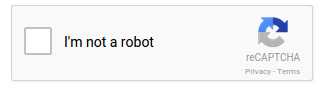
2. ReCaptcha – The user need to fill the field with the values in the recaptcha image. It is given below.
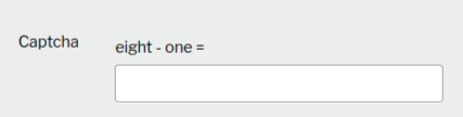
3. Mathematical Expression – Here the user need to fill the field with the mathematical expression. It is given below.
To use the recaptcha, you need to enter the recaptcha keys in the settings page of the plugin and check the recaptcha option here.
Form Element Name – This is the name of the captcha element in the form.
Style Class Name (optional) – This is the name of the style class used. For recaptcha, there are 4 predefined styles and we can select one from the list.
Empty captcha error message – This is the error message we received if the captcha field is empty.
Captcha content not matched error message – This is the error message if the entered value is not matched with the captcha image.
JQuery event handlers – It will support for running custom javascript on change, keyup, keydown, blur, mouseover, mouseout, mouseup, mousedown events of form elements.
11. Hidden Element
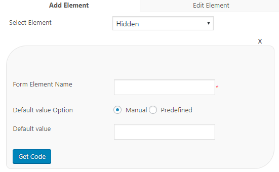
We can add a hidden element with the contact form.
Form Element Name – This is the name of the hidden field element.
Default value Option – We can use the manual value or the predefined value in the hidden field.
If you are selecting the Manual option, please enter the value in the given field.
If we select predefined, we can see a list of predefined values and these values are IP address, Browser – version, Platform – OS, Country code, user agent, Request URI, User ID, Username and email.
12. Numeric Field
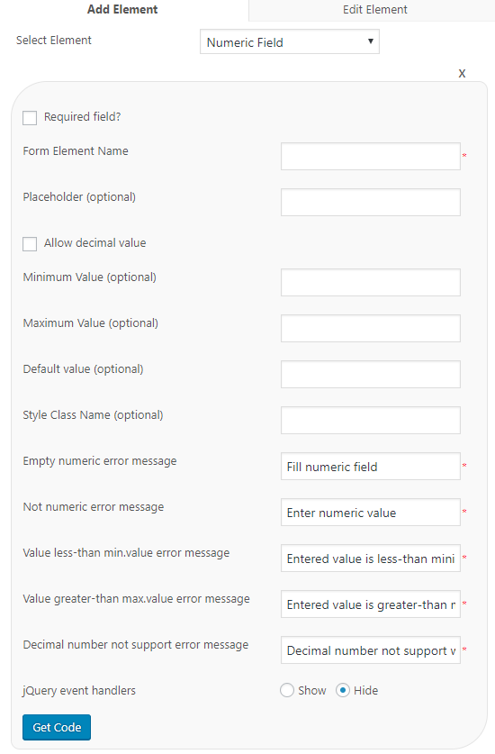
We can use the numeric element to enter phone number, zip code etc.
Form Element Name – This is the name of the numeric element.
Placeholder – This is the text we can display in the numeric field box.
Allow decimal value? – Do you want to allow decimal values in the numeric field? Tick this option.
Minimum Value (optional) – This is the minimum value we are expecting. This is optional one. If the value is 10, we cannot enter a value below 10.
Maximum Value (optional) – This is the maximum value we are expecting. This is optional one. If the value is 100, we cannot enter a value above 100.
Default value (optional) – This is the value displayed in the numeric field by default.
Style Class Name (optional) – This is the name of the style class used for the numeric field.
Empty numeric error message – This is the error message if the user not entered any value in the numeric field.
Not numeric error message – This is the error message if the value entered in the numeric field is other than a numeric value.
Value less-than min.value error message – This is the error message we received if the entered value is below the minimum value.
Value greater-than max.value error message – This is the error message we received if the entered value is above the maximum value.
Decimal number not support error message – This is the error message if we entered a decimal value in the non decimal field.
JQuery event handlers – It will support for running custom javascript on change, keyup, keydown, blur, mouseover, mouseout, mouseup, mousedown events of form elements.
13. Rich Text Area
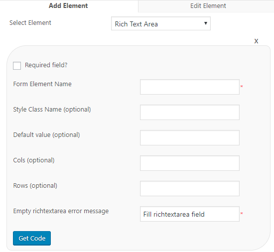
Form Element Name – This is the name of the form element.
Style Class Name (optional) – This is the name of the style class which can be applied to the rich text area element.
Default value (optional) – We can add a default value in the rich text field by default. Enter the default value here.
Cols (optional) – This is the number of columns present in the rich text area.
Rows (optional) – This is the number if rows present in the rich text area.
Empty ‘rich text area’ error message – This is the error message the user receives when the rich text area is left blank (in the mandatory condition) in the form.