This section displays all the contact forms with short code.
When you select this menu, you can see the default contact form name and short code “[xyz-cfm-form id=1] ”.
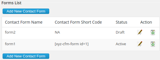
To create a contact form, please copy the contact form short code and paste this code in a page or in a post where you want to display the contact form.
To edit this default contact form options, please click the edit button to the right of the contact form name. To create a new contact form, please click the link “Add New Contact Form”
You can delete the contact form by clicking the delete button.
Add New Contact Form
Here you can enter the name of the contact form. The new form will save automatically and you can see the status ‘draft’ in the contact form page.

You need to ‘Save’ the contact form to activate the form.
Forms
The forms section contains the contact form with elements. You can create new elements from the add element section and use the code in the forms.
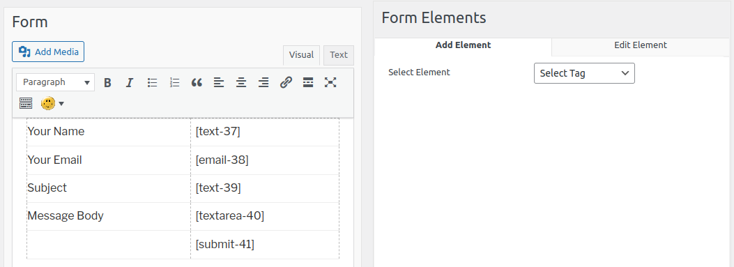
You will get a shortcode for this contact form after creating it. Use this short code in your contact page and the same contact form will appear in the contact page.
You can add many elements/ fields in the contact form.
You can use name fields, emails, addresses, phone number, date, captcha, file upload options in the contact form.
Form Elements
Form elements are the elements used in the form like Name, Email etc.
You can add a new element or edit the existing element here.
1) Add Element
There are several tags for the elements. Based on these tags you can create new elements and create code for the elements. The different tags are listed below. You can create a code for each element and need to use the code in the contact form. You can specify a style class with every element.
-
Text Field
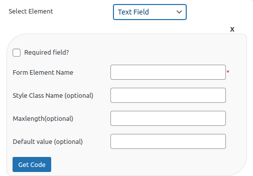
This field is used to obtain text values like Name, Job etc.
Form Element Name – This is the name of the form element. Admin can add any name here like yourname, subject, message etc. as the form element name.
Note : DO NOT add “name”,”day”,”month”,”year” as the form element name. WordPress don’t allow these names as element name.
Style Class Name (optional) – This is the css style class name for this text field element. If you want any special style for this field, you can add the style class here.
Maximum Length – This is the maximum length for the text. If we have entered the value 10, we can enter a text of 10 characters.
Default Value – This is the default value of the text field. This value will be displayed in the contact form by default.
You can make this element a mandatory one in the form by ticking the option ‘required field’. After adding the value click the ‘Get code’ button and it will generate a code. You can copy this code and paste in the contact form in the Forms section.
-
Email Field
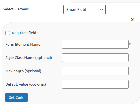
You can use this element to display email fields. If you want to capture email details from your user, please use this field.
Form Element Name – This is the name of the form element. Admin can add any name here like email, emailaddress etc. as the form element name.
Style Class Name (optional) – This is the css style class name of email field element. If you want any special style for this field, you can add the style class name here.
Maximum Length (optional) – This is the maximum length for the email. If we have entered the value 10, we can enter email of 10 characters (total) only.
Default Value – This is the default value of the email field. This value will be displayed in the contact form by default.
You can make this element a mandatory one in the form by ticking the option ‘required field’. After adding the value click the ‘Get code’ button and it will generate a code. Use this code in the Forms section.
-
Text Area
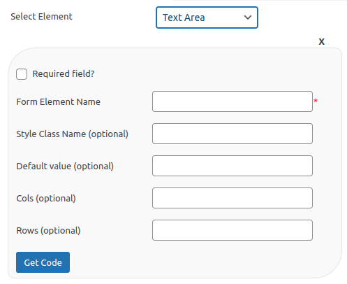
Text Area is using to get a descriptive detail from your user.
Form Element Name – This is the name of the form element. Admin can add any name here like message, emailbody etc. as the form element name.
Style Class Name (optional) – This is the css style class name of the text area field element. If you want any special style for this field, you can add the style class here.
Default Value – This is the default value of the text area field. This value will be displayed in the contact form by default.
Cols (optional) – This is the number of columns present in the text area.
Rows (optional) – This is the number if rows present in the text area.
You can make this element a mandatory one in the form by ticking the option ‘required field’. After adding the value click the ‘Get code’ button. Use this code in the Forms section.
-
Drop-down menu
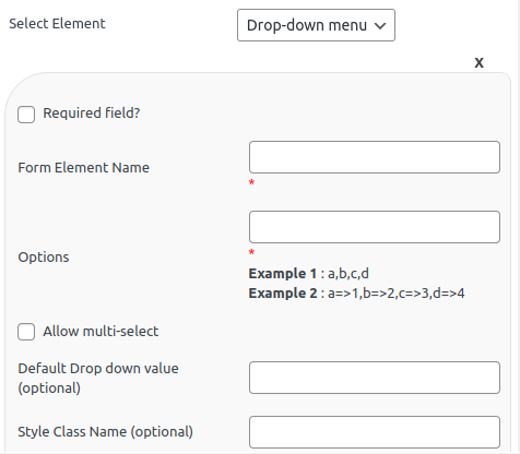
Form Element Name – This is the name of the element.
Options – We can add the values of drop down menu here. There are 2 options for entering the drop down values.
1. We can add the values using comma separated values like a,b,c,d. These values will display in the public side.
2. We can use a “key => value” format with comma separation. Example a=>1, b=>2. Here a and b are keys and 1 and 2 are values. In this format we are displaying the values (1,2) in the public side and the key (a,b) for the internal use.
If you want a contact form with different departments, you can use the departments as values and their respective email addresses as keys. When a user select a department, the contact mail can be send to that department email address with the help of this format.
Allow multi select – If you want to allow your users to select multiple values in the dropdown menu, tick this option.
Default drop down value (optional) – This is the drop down value selected, by default.
Style Class Name (optional) – This is the optional style class to the drop down field.
-
Date
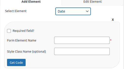
Form Element Name – This is the name of the date element. (eg: date, birthday etc.)
Style Class Name (optional) – If you have any style class for the date field, you can enter the style class name here.
-
Checkboxes
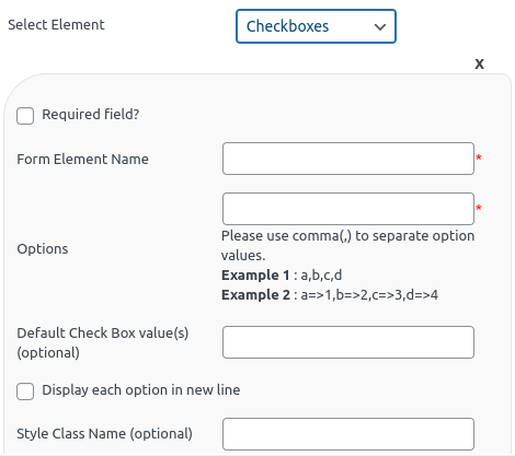
Form Element Name – This is the name of the check box element.
Options – We can add the values of check boxes menu here. There are 2 options for entering the check box values.
1. We can add the values using comma separated values like a,b,c,d.
2. We can use a “key => value” format with comma separation. Example a=>1, b=>2. Here “a and b” are “keys” and “1 and 2″ are “values”. In this format we are displaying the values in the public side and the key for the internal use.
If you want a contact form with different departments, you can use the departments as values and their respective email addresses as keys. When a user select a department, the contact mail can be send to that department email address with the help of this format.
Default check box value (optional) – This is the check box value selected by default.
Display each option in new line – If you want to display each item in a new line, please tick this option.
Style Class Name (optional) – This is the optional style class to the check box field.
-
Radio Button
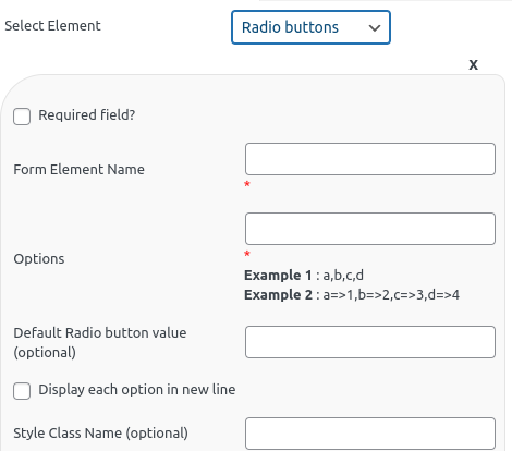
Form Element Name – This is the name of the radio button element.
Options – We can add the values of radio button menu here. There are 2 options for entering the radio button values.
1. We can add the values using comma separated values like a,b,c,d.
2. We can use a “key => value” format with comma separation. Example a=>1, b=>2. Here “a and b” are “keys” and “1 and 2″ are “values”. In this format we are displaying the values in the public side and the key for the internal use.
If you want a contact form with different departments, you can use the departments as values and their respective email addresses as keys. When a user select a department, the contact mail can be send to that department email address with the help of this format.
Default radio button value (optional) – This is the radio button value selected by default.
Display each option in new line – If you want to display each item in a new line, please tick this option.
Style Class Name (optional) – This is the optional style class to the radio button field.
-
File Upload
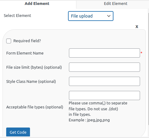
If you want to add the file upload option in the contact form, please use this element.
Form Element Name – This is the name of the file upload element.
File size limit (bytes) (optional) – This is the size of the file that can be uploaded. You need to enter the size in bytes. If this field is leave empty, there is no file size restriction and the user can upload files of any size.
Style Class Name (optional) – This is the optional style class name of the file upload field.
Acceptable file types (optional) – This is the acceptable file type. If you want to accept only PDF files, you can enter that value here. If there are one or more file types, use comma(,) to separate file types. Do not use .(dot) in file types. Example : jpeg,jpg,png
Note: If you have not entered any acceptable file types, it will upload all files.
It is recommended to use some file types as acceptable files to prevent hacking attempts.
Also do not use a dot ( . ) with the extensions.
-
Submit Button
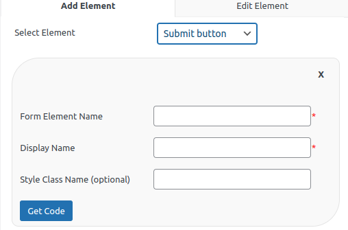
Form Element Name – This is the name of the element
Display Name – This is the name displayed on the submit button.
Style Class Name (optional) – This is the optional style class name of the submit element.
Note: Only one submit button is allowed for a contact form.
-
Captcha
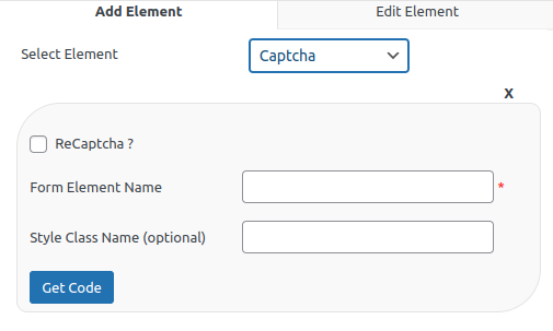
We are providing 2 types of captcha. The standard image verification captcha by our system and the recaptcha. To use the recaptcha, you need to enter the recaptcha keys in the settings page of the plugin and check the recaptcha option here.
Form Element Name – This is the name of the captcha element in the form.
Style Class Name (optional) – This is the name of the style class used. For recaptcha, there are 4 predefined styles and we can select one from the list.
2) Edit Element
In the edit element section, you can edit the values of the elements and these will automatically updated in the contact form. Once the code is generated, you need not change the code even you changed the values of the element. This is a main advantage of the XYZ Contact Form Manager.
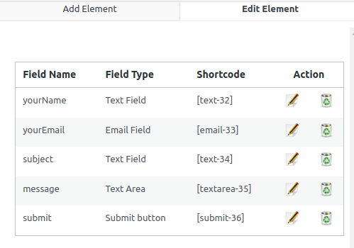
Here you can select the element to edit and after editing the values, you can update the element.
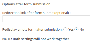
Options after form submission
After the form submission we can redirect the user to another link or re display the empty form.
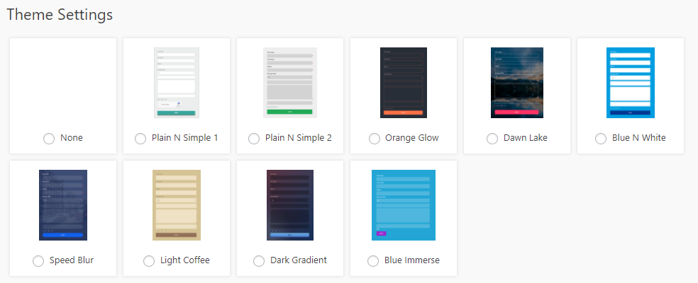
Theme Settings
In the theme settings there are 3 free themes available and we can select one theme if required.