Manage Popups
We can see all our popups and create new popups in “Manage Popups” page. We have 5 types of popups as explained earlier.
We can see all these popups in the manage section.
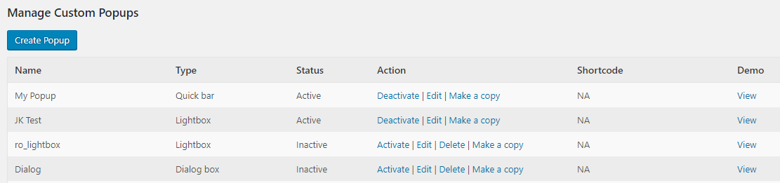
To create a new popup, please click the “Create Popup” button.

Here we can enter the name of the popup and select the popup layout. We have 5 types of display layout.
Lightbox, Dialog Box, Full Screen Popup, Quick Box, Quick Bar.
Here we can create a Lightbox Popup.
Lightbox
Lightbox is a popup having a background overlay and a content box to display contents.
The lightbox settings are given below.

Content : This is the actual content of the lightbox. You can enter anything here like text, image, subscription form, video, audio, shortcodes from other plugins etc.
We are using the WordPress default HTML editor in the lightbox Pop plugin and so you can see the visual as well as the HTML formats of the content.
There is also another setting, Show referrer URL based messages?
This is used to display some predefined messages for referred users (users referred from other sites).
Consider if you want to display a particular message to users who came to your site from another referrer site say google.
You can display a special message like “Hey googler, welcome to our site”, to those users who came from google.
For yahoo users, you can set another message and so on.
So the referrer messages are special messages for the referred users.
If you have enabled this option Show referrer messages?, the referred users will get the referrer messages and others will get the content added here.
Also if you want to display different messages for a user one after another, you can separate the content with the code {xyz_pop_content_break}.
Consider you want to display 2 popups to the visitor, one after other, you can add the 2 contents in the content section separated by the code {xyz_pop_content_break}. Now the user will get 2 popups one after other.
Position Settings
Here we can set the position of the lightbox in your webpages.
There are 2 options for positioning the lightbox, predefined settings and manually edit settings.
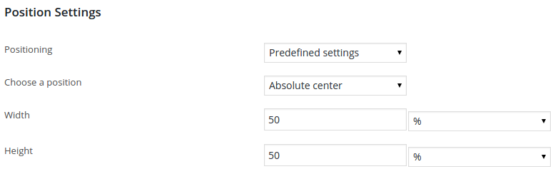
In the predefined settings, you can select one position from the predefined 9 positions.

You can place the lightbox in the top left corner of the webpage, on left center, on bottom left corner, on bottom center, on bottom right corner, on right center, on top right corner, on top center and the absolute center of the webpage.
Also you can set the height and width of the lightbox in percentage as well as in pixel values.
In the manually edit position setting, you can select the display position.

The 4 display positions in the manually edit settings are top left, top right, bottom left and bottom right.

For the top left position, you can set the top coordinate and left coordinate.
Top coordinate is the distance of the lightbox from top of the webpage and left coordinate is the distance from left side of the webpage.
The width and height are same as that in the predefined position settings.
Effect Settings
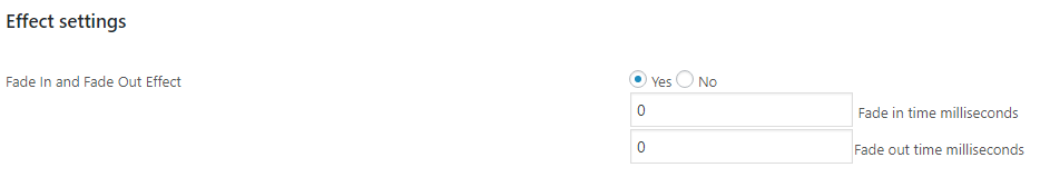
Here we can enable or disable the fade in and fade out effect settings.
Also we need to enter the fade in and fade out time in milliseconds.
Display Logic Settings
This section allows us to select the lightbox display logic.

Display Control Cookie Name – If you donot want to display the popup to users having a special cookie, we can use this option. Here enter the cookie name and the popup won’t display to the users having this cookie in their browser.
Display Logic – This is the logic how to display the lightbox in our webpages. There are 3 options for the lightbox display.
1. Based on delay
2. Based on number of pages browsed
3. both
In the “Based on delay” logic, the lightbox will appear after a delay. You can set this delay.
In the section “Delay in seconds before rendering” you can enter the delay in seconds. If it is “0(zero)” the lightbox will appear without any delay.

In the “Based on number of pages browsed” logic, the lightbox will appear after the user browsing some pages entered in “Number of pages to browse before rendering“.

In the “both” option, the lightbox will appear after a particular delay and after the user browsed some pages.
Repeat interval for a user – This is the lightbox repeat interval for a user. If you want to display the lightbox to your user after 30 minutes of first display, you can enter that value here. If this value is 0(zero), the lightbox will appear on every trigger/load.
Maximum number of times that the popup should display – Admin can set the maximum number of display of popup here. (Note: It is the total number of display of popup in the system and not per user.) If the value is 20, the popup will display 20 times only. Set the value 0 (zero) for unlimited display.
Reset Counter – If you want to reset the counter, please use this option. This is applicable only of you are using the “Maximum number of times that the popup should display” option. (Note: This option will display when you are editing a popup)
Do not show popup for logged in users ? – If you donot want to display the popup to logged in users, select the YES option. Otherwise use the NO option.
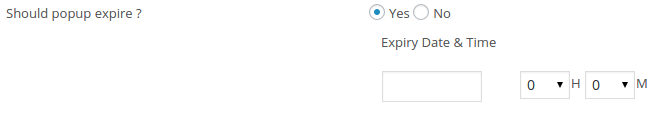
Should popup expire ? – If want to expire the popup after a time, please select it and enter the date and time.
Display trigger – We can display the lightbox on loading of the page, when clicking any space or a particular location in a page, on exiting the webpage, on mouse over an element or mouse out from an element in the website.
When we select “On Load”, the lightbox will appear when the loading of the page completed like in the free version.
If the selected trigger is “On Click”, the lightbox will appear only when the user click on the page based on the trigger element.
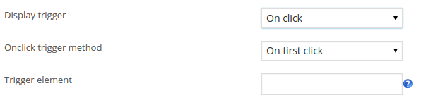
There is an option “Onclick trigger method“.
You can select any one of the options “on first click” or “on every click”.
If you selected the value “on first click”, the lightbox will appear only on the first click in the element.
If the selected option is “on every click”, the lightbox will appear on every click on the element.
Trigger Element– If you leave this empty, lightbox will trigger when anyone clicks on body.
Otherwise you can specify the element which when clicked must trigger lightbox. You can specify any of the formats below.
tagname => eg: img
classname => eg: .myclass
id => eg: #myid
If you are using a tag name, the lightbox will triggered when the user clicked on the element with the tagname.
The same is with the class and id.
For example, if you want to display the lightbox when clicking on an image, you can use this option.
Add a tagname or class or id to this image and use this with the trigger element. Now when anyone click on this image, a lightbox will pop up.
“On Exit” is another type of trigger element. Using this trigger, we can display the lightbox when anyone try to exit the webpage.
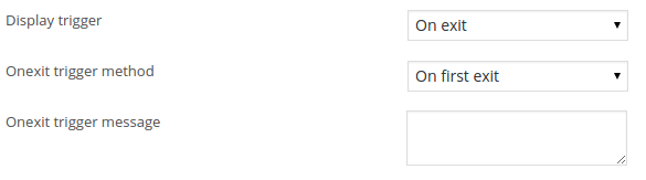
There are 2 types of “On Exit trigger” method, on first exit and on every exit.
On First Exit – If the selected option is “On First Exit”, it will display the lightbox when the user tries to exit the web page in the first time.
On Every Exit – In this option, it will display the lightbox whenever the user tries to exit the webpage.
On exit trigger message – We can add an alert message with the on exit option and this message will be displayed first with the default browser alert.
On Mouseover is another trigger and the popup will display when we mouse over an element.
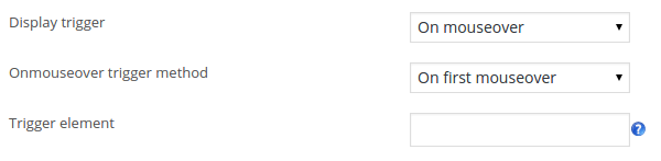
We can display the popup on first mouse over or on every mouse over.
In the trigger element section, we need to enter the trigger element and when user mouse over this element, it will display the popup.
You can specify any of the formats below.
tagname => eg: img
classname => eg: .myclass
id => eg: #myid
If you are using a tag name, the lightbox will triggered when the user mouse over on the element with the tagname.
The same is with the class and id.
On Mouseout is the final trigger method and here the popup will display when we mouse out from a section.
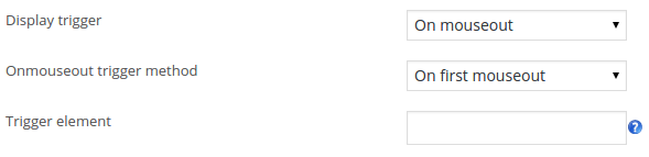
For example if we use the body as element and the user mouse out from the body, it will display a popup. Here also we can display the popup on first mouseout and every mouse out.
Display as iframe – We can display the lightbox in iframe or in the same page.
If you are using the iframe, any link in the lightbox or buttons will open in the same lightbox.
To open a link in a window outside the lightbox or to use a social media button, please disable the iframe display.

If content is larger than window? – If the content of the lightbox is larger that the window, you can hide the extra content or show a scroll bar to display the extra content. You can select the option here. This feature is not applicabale in case of iframe display.
Display devices – You can select the devices where you want to display the lightbox. We can display the lightbox in desktop/PC or(and) Mobile/Tablet.
If you select the “Desktop only” option, the lightbox will display only if we viewed it from a desktop/PC.
If the selected value is “Mobile only”, we can see the lightbox if viewed from a mobile/tablet.
To display the lightbox in all devices, you need to select the option “Both desktop and mobile”.
Popup Closing Settings
These are the settings used to close the lightbox. There are different options for closing the lightbox.
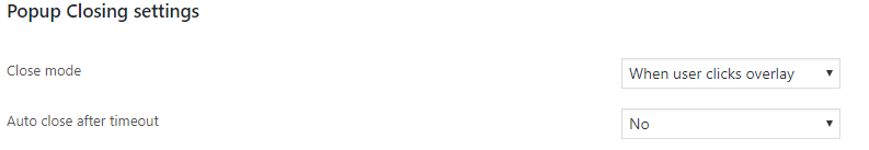
Close Modes – There are 3 types of closing modes in lightbox.
- When user clicks overlay
- When user clicks close button
- When user clicks an element within the popup content.
When user clicks overlay – If you select this option, the lightbox will be closed/hide when anyone click on the overlay.
When user clicks close button – In this option, the lightbox will close if anyone click on the close button.
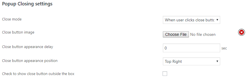
Close button Image – You can upload a close button image here.
Close button appearance delay – Using this setting, you can display the close button after a time period.
If you add the value 5 sec, the close button appear only after 5 seconds and the user can close the lightbox after 5 seconds.
Close button appearance position – There are 4 positions for displaying the close button.
Top right, top left, bottom right and bottom left. You can select any position from the dropdown menu.
Check to show close button outside the box – If you want to show the close button outside the popup box, please enable this option. Otherwise the close button will display inside the pop box.
When user clicks an element within the popup content – This option is used to close the lightbox when anyone click on a particular element in the lightbox content.
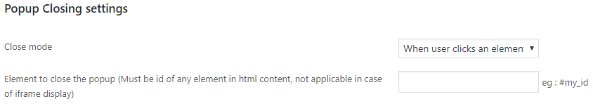
Element to close the popup – Here you need to add the id of the element. Then anyone click on the element with the same id, the lightbox will close. For example consider if you have added an image or text inside the popup content with an id and if you are using the same id here as closing id, the popup will close when anyone click on this image or text.
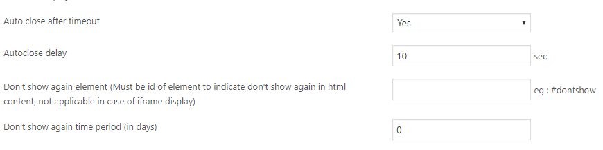
Auto close after timeout – If you want to close the lightbox automatically after a delay, use this option.
Auto close delay – Enter the time period to close the lightbox automatically. The time is in seconds.
Don’t show again element – If you want to use the “Don’t Show Again” message with the popup, you can add such a test/image in the popup content with an id and use that id here. If the id is “dontshow”, please use it like #dontshow. This feature is not applicable in case of iframe display.
Don’t show again time period (in days) – This is the time period for “Don’t show again” closing mode. If the value is 5 (days), the popup will display again after 5 days.
Javascript Callback Settings
You can use some javascript callbacks to trigger the lightbox content when displaying the lightbox or when closing the lightbox.
This is useful to stop a video when we close the lightbox or to autostart/continue a video when a lightbox displayed.

Callback on popup display – This is the javascript callback when a popup is displaying. We can use a javascript code to resume/autostart a video when displaying the lightbox.
Callback on popup hide – The javascript code used here will active when we close the lightbox. This can be used to stop a video when we close the lightbox. There are javascript code to stop a video and you need to use the code here to stop the video.
Style Settings
Here we can select the style of the lightbox.
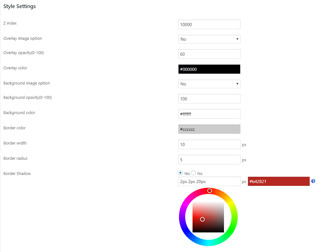
Z index – Z index determines whether the lightbox display under or above the web pages.
As the value of z index increases, the lightbox become on top(above) of all page contents.
Overlay image option – In the premium version you can add an image for overlay.To use image as overlay, please select this option.
Overlay image – You can upload the overlay image here.
Overlay opacity(0-100) – This is the opacity level of the overlay. If the value of opacity is ‘0’, the overlay should be a transparent one. If the value is ‘100’, the overlay should be opaque.
Overlay color – We can set the overlay color here using a color picker.
Background image option – In the premium version you can add an image for popup content background. To use image as background, please select this option.
Background image – You can upload the background image here
Background opacity(0-100) – This is the opacity level of the background image. If the value is ‘0’, the background should be a transparent one. If the value is ‘100’, the background should be opaque.
Background color – We can select the lightbox background using a color picker.
Border color – This is the color of the lightbox border.
Border width – We can set the width/thickness of the lightbox border here.
Border radius – If you want a rounded corner for the lightbox, use this option. As the radius increases, the roundness also increases. Use ‘0’ for rectangular edges.
Border Shadow – We can add the shadow to the lightbox pop. We need to follow the box shadow css format here.
In the first column, we need to enter the values in the format [h-shadow v-shadow blur spread]
In the second column, we can enter the shadow color.
Lightbox Placement Settings
Placement mechanism – This is the mechanism we are using to add the popup in pages.
There are 3 placement mechanisms
1. Automatic – Here the popup will load in all pages.

2. Specific Pages – Here you can specif the pages you want to display the popup. You can display the popup in pages, posts and in wordpress default home page .

3. Manual – If you want to display the popup in particular pages, use this option. Now you need to add the short code in the pages where you want to display the popup.

The shortcode is present only for manual mechanism.
Reset cookies?(for testing) – This is available when we edit a popup
For testing purposes we need to reset the cookies. If you want to see this popup immediately after you make changes in any settings, you have to reset the cookies.
Tick this option to reset the cookies.
After creating the popup we can see a demo of the created lightbox pop.
For this please go to the “Manage custom popups” and you can see a “view” link.
Click on the “View” link and we can see the demo.